
Shifting Perspectives
Isabelle Thorpe





While on my first Health Care Assistant shift, I spent time supporting the HCA I was shadowing to help the nursing team take blood from a patient. Previously, multiple failed attempts had been made putting in a canula because the patient’s veins were difficult to use. To help the team I was working with, I held the patient’s hand to keep them still so that the needle could be inserted by a nurse without causing any further harm to the patient. After some time, blood was successfully drawn with the help of an ultrasound machine and a few different angled approaches.
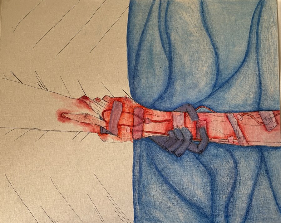
The time I spent with this patient made me reflect on how distressing hospital environments are for vulnerable patients and how important the healthcare team is for the patient to feel safe in such a confusing environment. I chose to explore this experience visually as it showed me all sides of medicine, but especially how important compassion, empathy and genuine care for patient wellbeing are during critical moments for the patient.
I used biro, coloured pencil and watercolour paint. By using blue and red watercolour, I aimed to symbolise a calm, helping and supportive environment with the use of blue paint for the medical equipment and my gloved hand. In my piece, this contrasts against the use of red paint to illustrate the patient’s pain, fear and distress from being surrounded by unknown people and the repeated attempts to take blood. Furthermore, I used the red watercolour paint to illustrate how the patient’s fear spread to me as I held their hand and saw what they were going through as their grip tightened around my hand. This medium brings to life both my and the patient’s experience on the ward – and how different the perspective is when you are looking through the patients’ eyes. Being trusted to comfort someone during a distressing time made me feel incredibly important to the patient and also that I was contributing on the ward.
Creating this piece of work allowed me to reflect on my HCA shift more and reminded me why the medical profession is so unique and amazing in its nature. We have the privilege to be there on what could be someone’s worst day and offer them the care and support they need to get through.
Highly Commended Effective Consulting Creative Assignment,
Year One 2025/6
I found this art piece very thoughtful. When talking to patients, a relationship is built with a patient and we may end up sharing some of their feelings and pain too, which has been captured very well in this artwork. I thought the colours were used to great effect. As mentioned in the description, the red on the patient’s arm represents the fears and feelings, however the student’s arm is white almost like it is an empty canvas, with some red beginning to bleed onto the student’s arm. I think that this powerfully shows the type of relationship that is shared between the patient and medical student when time is spent to talk to the patient and provide support for them.
This artwork can be interpreted in several different ways. One interpretation highlights how a patient’s experience of healthcare can be traumatising, potentially leaving them feeling emotionally scarred, vulnerable and confused. It emphasises the importance of healthcare professionals taking the time to listen, communicate effectively and demonstrate compassion, as these actions can help alleviate a patient’s confusion and anxiety. In the artwork, this is symbolised by the patient’s blood spreading onto the healthcare assistant’s (HCA’s) arm, representing how the patient’s distress and vulnerability can extend beyond their own experience and affect those providing their care. The separation between the patient and the HCA is further conveyed through the contrasting colours within the artwork. The patient’s bed is covered in blue, which contrasts with the white background surrounding the HCA. This visual distinction may symbolise the divide between patients and healthcare professionals, reflecting how patients may feel isolated, vulnerable and disconnected from those responsible for their care. Within a hospital environment, healthcare professionals can become occupied with their clinical responsibilities, potentially overlooking the emotional impact of illness and treatment on patients. Ultimately, the artwork highlights the importance of listening, providing clear explanations and offering reassurance to help patients understand their experiences, reduce anxiety and feel supported, reinforcing the need for compassionate and patient-centred care.
This piece really speaks to me as I feel it captures the crossing of boundaries that is so intrinsic to the medical profession; the piece is distinctly split into two halves. The artist describes using the blue to symbolise the calm and supportive environment of the ward, but the fact that the patient reaches beyond the blue for the human hand of the artist symbolises how, as far design and attention to detail can aid a patients experience, ultimately they need to humanity and the hand of healthcare workers for true stability. Furthermore the fact that the artists glove is a deeper blue than the bed further symbolises this idea that the human connection is more important the physical environment. The red contrasting with the blue can be seen as a highlighting the sharpness of the pain of the patient.
The use of the red watercolour “bleeding” onto the artist also explores how the suffering of patients can “bleed” onto the doctors, leaving physical and psychological stains, while at the same time the emotional support taking some of the blood further symbolises how doctors can take some suffering away from patients.