
Blending In
Charlotte Hunter





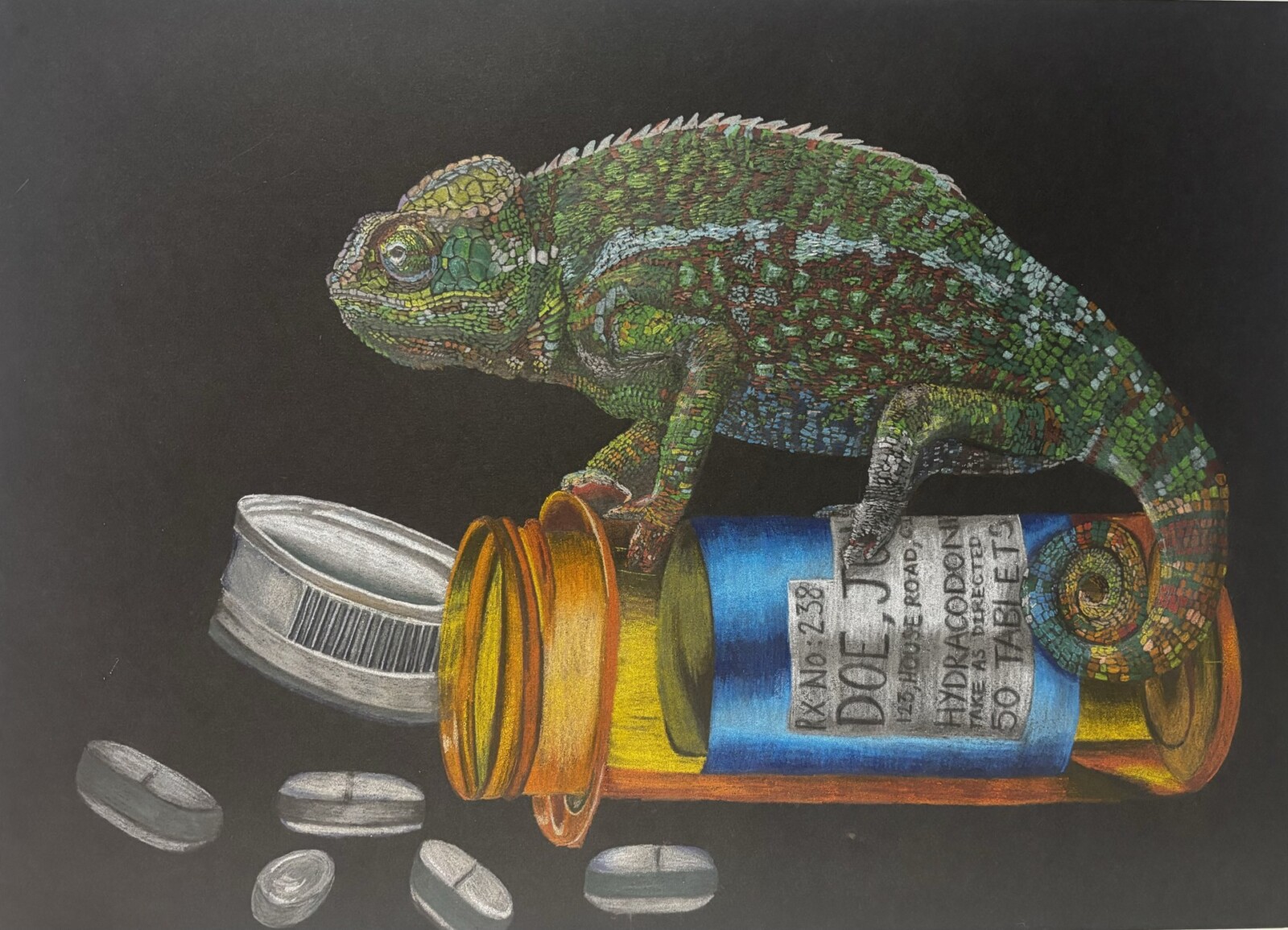
This piece was inspired by a conversation with a patient who had been hospitalized increasingly frequently in their old age. It depicts the sentiment of ‘losing yourself’ whilst in hospital. Eventually you feel as though you become synonymous with your condition. Many patients express this notion, feeling like they blend into the background, as the chameleon merges with its environment. The label on the pill bottle is anonymised to demonstrate the eventual desensitization of healthcare workers to patients as individuals with unique lives and stories.
I found it easy to empathise with both sides of this. As a patient, I understand the difficulty in maintaining a sense of self when confined to a hospital ward. Equally I understand that as a healthcare worker, you must maintain a certain emotional distance from patients, to fulfil your duty of care to them to your best abilities. Small actions, like taking time to talk to a patient about their life outside hospital or taking notice of how you can help them feel more presentable, can give back some of the individuality they lost. This was something I had the opportunity to do, as a medical student shadowing an HCA, who has the fortune of having more time to spend with each patient.
In creating this piece, I selected coloured pencil as I thought it was the best medium to help me convey the hues and detail of the chameleon. The black background symbolises everything else falling away in the face of illness – being devoid of individuality. You assimilate your disease as it begins to define you. This is symbolised by the colours of the pill bottle creeping onto the chameleon.
I also researched how a chameleon’s mood can impact their colouring. Blues and deeper greens suggest calmness; reflected in the label to acknowledge the peace medical care brings to patients. Vivid greens/yellows/oranges indicate a chameleon is stressed or feeling threatened. These emotions were pervasive on the elderly care ward, with patients requiring comprehensive, often intrusive, care, leaving them feeling vulnerable. The combination of these colours being depicted on the chameleon is representative of the conflicting emotions that arise from long-term hospitalisation.
Joint second place prizewinner, Creative Assignment, Year One, 2025/26
A striking and beautiful image using the “more than human” to illustrate a deeply human experience of othering and depersonalisation which can occur with hospitalisation and serious illness. Investment of time and vulnerability by sharing of something of “self” for both parties has therepeutic benefits for both the caregiver and receiver. This image speaks to me of the importance of compassionate care.
The piece ‘blending in’ considers how a person can lose their identity through the process of becoming a patient and being diagnosed with an illness. The piece is made up of two main componants : the chameleon and the pill bottle which sits infront of a plain black background, on the surface the pill bottle is a physical representation of the medication that patients are perscribed apon diagnosis or hospitalisation and acts as universal imagary of treatment in general. However closer inspection of the pill bottle ,in particular the label, provides a deeper understanding of patient experience, with the bottle reading ‘JOHN DOE’ which is the term used in the medical field for an unidentified patient, suggesting that patients feel as if doctors view them not as an individual but simply see them through the lens of their illness making them feel as if their diagnosis consumes them. significantly the ‘ RxNo:238’ ,whilst exemplifying the loss of identity of the patient ( as they are reduced to a number in the system), also suggests a narritive from the doctors perspective as demonstrates the vast mass of patients they treat meaning that a patients loss of identity may be inevitable in a system that promotes fast paced care and lack of emotional investment in patients in order to maintain a high quality of care within hospitals. The chameleon is known for its ability to change colour and blend into the enviroment its placed in, signifying how patients feel they as if they no longer have individuality after diagnosis and throughout treatment, further exemplifying how diagnosis of an ill ness can change the way in which a person is viewed by those around them and how to doctors they become a part of the backdrop, as the viewer of this piece is made me consider the impact on mental health of patients losing their individuality. The black background could be veiwed as a symbol of how isolating being a patient can feel and the lonliness that acompanies this. In the artists description it conveys that the deliberate colouring of the chameleon in deeper colours was a way to demonstrate how medical care can instill calmness and peace in a patient as chameleons colours change dependent on mood further deepening my view of this work as I came to view it from an alternative, and more positive, perspective.
This piece is poignant, as it creates an emotional reaction for both patient and healthcare professionals. For a patient, it can be a visual and abstract way to show how they feel within a hospital setting and for doctors a viewpoint into how many patients feel towards their healthcare condition and subsequent treatment. I like the varied use of colour on the chameleon, representing the many different emotions a patient can undergo and how they are dynamic throughout the person’s care.
The piece elegantly conveys the mutual sense of detachment from one’s own identity from the perspectives of both healthcare providers and patients. The most striking feature of the piece being the anonymised pill bottle presents the patient’s feelings of identity as an illness, and the genericness of the bottle itself enforces the idea that without compassion in care, both doctors and patients can feel as though they are unrecognised. Contrasting a dull, black and shapeless background with the foreground focuses the viewers attention onto the illness of the patient and how they blend into the hospital setting – portrayed through the chameleon. The use of incomplete camouflage in the chameleon into the colours of the bottle demonstrates how patients’ identities can slip away from them if they aren’t recognised beyond their illness. This allows the piece to explain the importance of recognition and compassion in care.
I think this piece is striking in how it conveys the experience of patients who spend extended periods of time in the hospital. It shows how patients might begin to feel as though they cannot be separated from their condition, losing their sense of identity and merging into the background, much like a chameleon. The use of the black background represents well how a patient may be feeling when being ignored by healthcare professionals, as if they are disappearing into darkness. The anonymity of the medicine bottle further demonstrates the lack of identity patients can feel when an illness begins to takeover there lives. The piece overall highlights the how important it is for healthcare professionals to connect with patients and see them as a whole.
This is such an interesting way to convey the messages drawn from a conversation with a patient!
I personally found the measures taken to drive home the feelings of depersonalisation the most visually striking and discussion-worthy. At first glance, a viewer may read this as a shallow theme of the piece – only characterised by the John Doe label and illusive nature of the chameleon. However, upon deeper inspection we can notice the chameleon begin to blend into the medication – akin to how patients can feel as though they are little less than their conditions. Alternatively, the chameleon may also further the notion of depersonalised care in the sense that for a patient to become a chameleon – an animal – not only are they blending into the environment but they are being dehumanised as a result of their condition. No longer a person with thoughts and feelings outside of their care but a problem to be solved by doctors.
It feels as though the more you look into this piece the more layers there are to uncover! Such a thought-provoking piece of art!
This thought provoking piece explores the loss of identity that can happen in patients who are hospitalised for prolonged periods. The contrast between the bold colours of the chameleon and the dark background highlights the emotional complexity of healthcare, with the dark background symbolising the intense isolation of long term ill patients. The chameleon in particular is a powerful metaphor, as its ability to camouflage itself mirrors how patients can become engulfed by their illness, gradually losing their individuality, until like the chameleon they can no longer recognise themselves. The use of the anonymous Jane Doe label further reinforces this sense of identity loss. I think this piece is a powerful reminder that behind every diagnosis is a patient with their own identity and experiences, which should not be overlooked within the healthcare environment.
In this piece, the chameleon’s colours are changed by the medication bottle, which provides a visual representation of how a patient’s life is changed by a diagnosis. The patient can feel defined by their diagnosis, with that becoming an overwhelming factor in their life that overshadows everything else. This shown in the drawing, by the black background and the chameleon on the medication bottle being the sole feature of the piece. Along with the black background showing how illness can take over a patient’s life or identity, it also suggests isolation for the patient following their diagnosis as nothing else is present in the artwork. It is therefore very important for healthcare workers to take the time to talk to and support patients in hospital, as they may be feeling lonely. The John Doe name on the medication bottle also gives insight into patients losing their individuality after their diagnosis, which could contribute to feeling alone or misunderstood in hospitals. This piece has multiple key aspects that draw attention to patients feeling like they have lost themselves due to their diagnosis, which makes looking at the piece a good way to remind us of the importance of supporting patients as they navigate living with their illness.
This piece uses the idea of a chameleon to convey patient emotions which verbally might be difficult for them to express. The use of an animal is a creative way of portraying the dehumanization patients may feel they are subject to. The chameleon specifically has a a lot of interesting connotations. For example, a chameleon’s ability to blend into its surroundings depicts the lives of many patients within a hospital setting, feeling like they are blending into a sea of maladies and treatments being examined by overworked doctors. The genericness of the medicine bottle further shows the loss of identity patients experience, and the use of the black background could represent them “disappearing into the darkness”. I also like how the chameleon (representing the emotions of the patient) is the only colourful part of the painting, and how the pills are completely white. This could represent how the focus of medicine should be the emotions of the patient, rather than clinical treatments (represented by the pills).
A beautifully emotive piece. Living with chronic illness and experiencing frequent hospitalisation can profoundly shape one’s identity, and this artwork captures that process with striking subtlety.
The sheer size of the pill bottle in comparison to the chameleon represents how one’s whole world can shrink to encompass only their illness, allowing it to take over and overshadow other aspects of their identity and life. We can see the chameleon’s colour slowly blending with that of the pill bottle – its body remains largely green, but its tail has already taken on the bottle’s oranges and blues. This shows how, with time, one can become so enmeshed with their diagnosis that it is difficult to tell where one ends and the other begins. Crucially, the chameleon uses camouflage as a survival mechanism, suggesting that people diagnosed with chronic conditions may experience this shrinking of their identity and world not by choice, but rather for their own survival.
Furthermore, the label has the name “Doe, J”, the placeholder used for an unidentified patient, signifying a further loss of identity and selfhood. The fact that the pills are drawn in greyscale, whereas the pill bottle and chameleon are drawn in vivid colour, suggests how one can view their diagnosis as draining the colour and life from their world, and implies a lack of control over this process. Since the illness itself is never shown, only its treatment, the piece makes us question whether it is the illness or the treatment that is erasing this person.
This piece also reminds me of the importance of viewing a patient as a whole person and taking into account all biopsychosocial factors, rather than reducing them to just their diagnosis, or, as this artwork suggests, to a name on a prescription label.
I was drawn to this piece due to its eye catching imagery, the depiction of the chameleon sitting on top of a pill bottle emphasises to the viewer the effects that frequent hospitalization can have on a patients sense of identity, and the sense of ‘losing them self’ that emerges, especially when facing long term illness. This is depicted in the gradual colour change of the chameleon causing it to blend into the medicine bottle, mirroring the idea that a patient may feel that ,especially when in clinical settings, they’re viewed as just a person with a condition rather than an individual. I appreciate how the artist used colour to reflect the conflicting emotions they’d seen in an elderly care ward and how the use of vivid colours represented the distress they had witnessed from patients, however, the inclusion of ‘calmer’ greens and blues acknowledges the appreciation of treatment also felt by patients despite the non-ideal circumstances. Overall, i feel that this piece conveys an important message to the viewer about the impacts hospitalisation can have on a patients mental wellbeing, and hopefully will influence them, especially those working in a healthcare setting, to take the time to connect with patients to allow them to feel seen beyond their condition.
I think the colours and detail of this art piece drew me towards it. The bright colours contrast well with the dark background, perhaps symbolising how lonely hospital admissions can be, especially in older age. The use of Jane Doe as the name also symbolises the sense of isolation and loss of identity that frequent hospital admissions can cause.